The arxiv, started by Paul Ginsparg in 1991, was a pioneer for the Open Access movement in scientific publishing. Most (many?) working physicists, and an increasing number of scientists in other fields, take it for granted that they will share their research articles freely with everyone in the world by submitting to arxiv. The current submission rate is about 8,000 papers per month, and still growing linearly or possibly a bit faster.
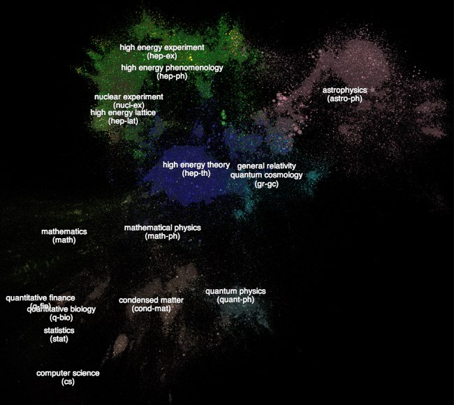
In addition to providing fast and easy communication of new papers, the arxiv is a resource ripe for data-mining. Say hello to Paperscape, a project by Damien George of Cambridge and Rob Knegjens at Nikhef in the Netherlands. This fun (and possibly useful) new tool creates a categorized/zoomable/clickable/searchable map of every paper on the arxiv. Apparently it’s been around since March, but I only heard about it yesterday, possibly because of this post on physicsworld.com. So here’s the birds-eye view of what the arxiv looks like:
There is a lot of data displayed here in quite a dense way. The different colors represent different arxiv categories: condensed matter, astrophysics, and so on. High-energy physics dominates the map, in part because that was the first field to participate in arxiv in the first place. Each circle is an individual paper, with the size representing the number of times that paper has been cited (within arxiv). You can pick out some of the big hits in the field — the accelerating universe, cosmic microwave background observations, AdS/CFT, extra dimensions, and so on. The locations aren’t random, either; circles are placed in proximity depending on how often they cite each other. So the fact that contiguous regions all have the same color isn’t built into the mapping algorithm, it’s a consequence of the (perfectly predictable) fact that papers in the same field cite each other more than papers in other fields.
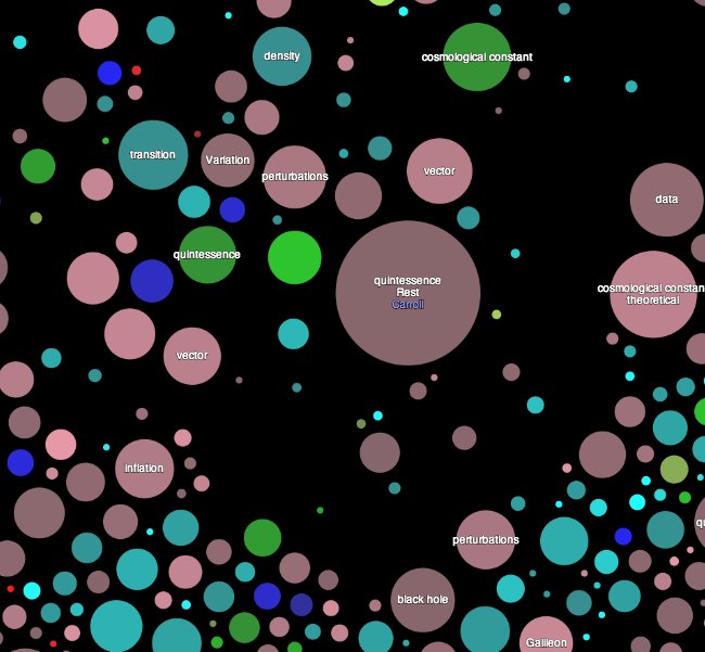
As you zoom in, the papers become more legible — when a circle becomes big enough, a word or phrase from the title appears, and eventually the author’s name. Here’s one of my papers, a bit standoffish from its surroundings:
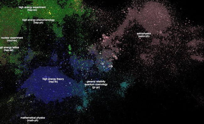
You can also search for authors, title words, and so on. Of course the first thing any working physicist will do will search for themselves. Here I am, my life’s work reduced to handy graphical form:
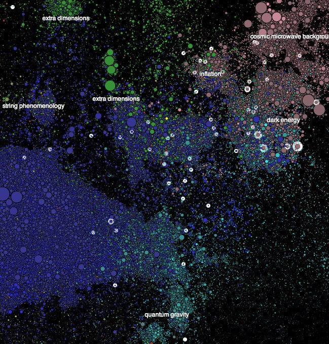
Click for a bigger and more legible version — or just go search yourself, by typing “?a s.m.carroll” into the search box. (Much more fun that way.) The white circles are the search results. Scattered all over the place, to nobody’s surprise; but most of my papers (and definitely the ones with the biggest circles) lie in that mixed-color overlap between gravity/quantum cosmology, astrophysics, high energy formal theory, and high-energy phenomenology. Somewhat zoomed-in:
Very fun in a narcissistic sort of way, but once you’re done ego-surfing I imagine it will also be a useful tool. Hopefully most researchers are already aware of the important papers in their areas of interest, but maybe you can discover some apparently highly-cited work right next to yours that you hadn’t known about. Or, even better, some less-cited work that maybe deserves more attention. Certainly it could be useful to people trying to dive into fields in which they are not yet experts. There are also options to look for recent papers, trending work, and more. Of course there is a blog.
Congratulations to Damien George and Rob Knegjens for such an interesting project. I wonder if they will write a paper about it and post it to arxiv?


Thanks Sean for the compliments and the very clear article. You managed to hit spot on exactly what Paperscape is all about and why it has the structure it does. One extra thing: brightness of colour represents age of the paper, but this doesn’t come across so well. Note the Higgs papers are brightest in yellow (yellow being hep-ex). We are going to implement a heat map overlay which shows age more clearly, and is very useful for identifying trending areas of research.
The version released in March is actually a bit different to the map (see my.paperscape.org), so you didn’t actually miss this map version. It was released only this past week.
Rob and I are still actively developing the map and are very interested to hear suggestions from the community as to its potential long term usefulness.
THANK YOU Damien George and Rob Knegjens. Something that can finally help me answer the question, “so what do you do with a degree in _____ ?” A lot of my peers are going to love this for the reasons you mention. It will definitely help us out when we attempt to write our senior thesis(or any paper). I imagine a lot of the veterans in the field will also enjoy the ease of use and the freedom to peruse unpopular topics without the fear of colleagues giving them a weird look; inspiration strikes in strange places.
Now, to keep it classy: Looks like Spergel has the biggest pair… 😀
(and) ‘it’s like twitter for your future overlords’.
Great work Damien and Rob. Nice blog Sean, love that droll humour.
So, who’s the brightest star in the firmament then? And wow, can you imagine a time lapse picture!?
I wonder how hard it would be to apply this to PubMed.
I named this map : continent of physics!
What I find so amazing is that all of those papers represent bits of a puzzle of human thought attempting to unpack the mechanics of God.
Can you tell me which two galaxies are the same?
Pingback: A Map of the arxiv Physics Literature. | Gordon's shares
I can see an elephant in the Map of Research Literature. Its blue head is in (hep-th) the trunk below (gr-gc) (Sic) and upper foreleg is at (math-ph).
@Damien George
A truly wonderful job.
Now, LHC has ruled out a big chunk of SUSY theories. Can we search “still viable SUSY” or “LHC ruled out SUSY”? I tried but get no result.
Thanks a lot for your very well written blog post Sean! It has generated a lot of traffic for us over the last week:)
As you suggest a search query in your blog, let me note that it’s now possible to link to a paperscape search query by appending /?s=your_query to the Paperscape address (with a bit of manual url encoding for now: ‘?’ -> %3F, spaces -> ‘+’ ). So the query “?a s.m.carroll” can be linked to with http://paperscape.org/?s=%3Fa+s.m.carroll, giving Sean Carroll.
Let me also note that we just finished implementing a heatmap colouring scheme for the map. It should now be easier to identify “hot” regions of recent activity and young papers that are picking up citations quickly.
Happy to provide some publicity — congrats on the great site!